#129 - ANDREW KOVACS, Architect and Curator of Archive of Affinities
SUMMARY
COACHELLA’S COLOSSAL CACTI, POSTMODERNISM AND CURATING IMAGES TO DESIGN
This week David and Marina are joined by Andrew Kovacs - Architect and Founder Office Kovacs and Curator of Archive of Affinities - to discuss the lack of opportunities for young progressive architects in the US, designing an installation for Coachella, the positives of Postmodernism, using archive of affinities as a design resource, staying open-minded, and more. Enjoy!
ABOUT ANDREW
Andrew is a Los Angeles-based architectural designer and educator. His work on architecture and urbanism has been published widely including A+U, Pidgin, Project, Pool, Perspecta, Manifest, Metropolis, Clog, Domus, and The Real Review.
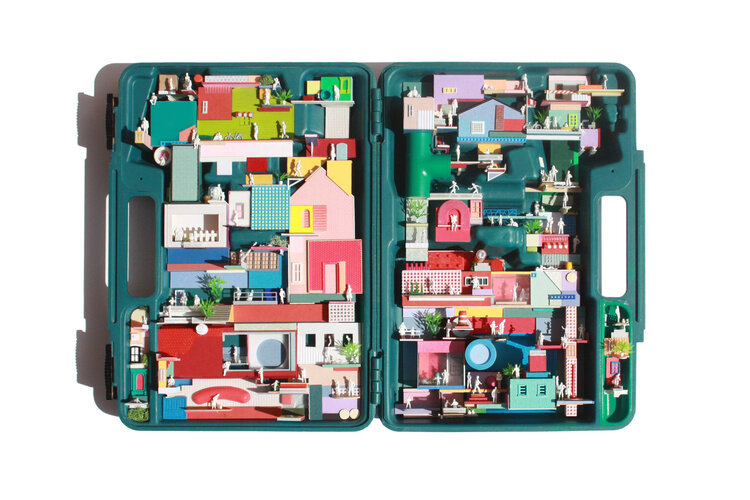
Additionally, Andrew is the creator and curator of Archive of Affinities, a widely viewed website devoted to the collection and display of architectural b-sides. In 2015, Andrew published the book, Architectural Affinities as part of the Treatise series organized and sponsored by the Graham Foundation in Chicago.
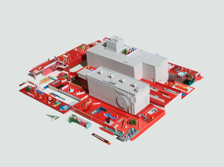
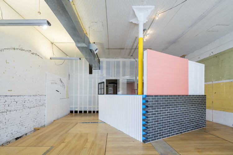
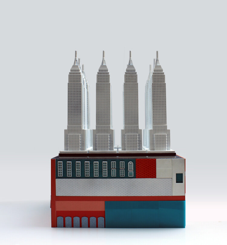
Andrew’s design studio, Office Kovacs works on projects at all scales from books, exhibitions, temporary installations, interiors, homes, speculative architectural proposals and public architecture competitions. The recent design work of Office Kovacs includes a proposal for a network of parks in the downtown Los Angeles alleys, a large-scale installation entitled “Colossal Cacti” at the Coachella Valley Arts and Music Festival, and an experimental camping pavilion in the Morongo Valley Desert.
HIGHLIGHTS
TIMESTAMPS
(00:00) Kovacs’ office and understanding Archive of Affinities as a tool for designing.
Archive of Affinities is the longest continuous project of Office Kovacs… the project that has no deadline, no client, and no budget [. . .] It became this tool that flips back and forth between something that is collected and shared on the Internet, to material that is then mobilized into other projects.
When you're comparing something, there's usually a distance between the two things and (for Office Kovacs) that distance is collapsed… Where say two-floor plans in the case of Collin Rhode, those two-floor plans always remained separate as a kind of comparison. But in my work, those floor plans then become contiguous to make a new whole. Those existing parts are to be understood as fragments that can then be pieced together into something else. (07:23)
(12:38) Using old advertisements as inspiration for architectural representations.
(21:01) Using recognizable forms in his work.
Using things that already exists, like a ready-made or found objects, at one level provides a kind of recognizability of those things to a broader audience, like a pitched roof. Everyone can kind of recognize a pitched roof, not necessarily just architects. So maybe baked into that (my work) is the intention to produce designs that can reach a broader audience. So not just architecture for architects, but architecture for a larger group of people. Or another way to think of it is rather than bringing people to architecture, you could bring architecture to the people. (24:17)
(27:24) Kovacs on Postmodernism and its rejection by the architecture community.
I think that postmodernism in some way a super successful moment for architecture and for some reason I think architects don't like things that are successful at the end of the day. (28:58)
People [who reject postmodernism] must have a very difficult time moving through the world! I think that attitude is just a kind of blockade against actually meaningfully changing the way the world is. In some regards you kind of have to work within the system that exists. [. . .] I think architects should probably be more open and inclusive to different points of views, postmodernism being one of them. But also, you know, design sensibilities and personal tastes change every so often or the cycles sometimes are faster than others. So, I think if a broader audience might find the postmodernism sensibility appealing, I don't know why we shouldn't try and capitalize on that. (29:25)
(34:44) How the leaning tower of Pisa inspired the Colossal Cacti design at 2019 Coachella music festival.
It goes back to thinking about two different things that we we’re always thinking about: One is the leaning tower of Pisa where the most important quality of the tower, the fact that it's falling down is something totally wrong in architecture, yet becomes its most important asset because all these people want to go see it and then, the countless reproductions of the tower, whether in miniature that you can collect or then miniatures [which] change functions from everything to a lipstick holder, to a bottle opener, to an earring, or to something you could wear as a ring. (38:50)
When you move the camera [so] that people are trying to frame themselves—whether they're holding up the tower or using the [Paul Smith] pink wall as a background—people are engaging with the space in front of the these buildings or architecture in a totally different kind of way than they would normally engage any other building. (41:43)
(53:35) Translating art installation design to building design.
(01:12:15) Kovacs on the lack of opportunities young progressive designers have in the United States and the MoMA PS1 Young Architect’s installation competition.
The problem with these types of projects is the budgets are so low—minus something like Coachella—and they require so many resources from the architects doing them, that at some point, is it really worthwhile to do these things? (01:14:12)
Young architects in the United States who are trying to do something innovative, original, or that's their own thing, get confined to a world of academia. I think in Europe there are competitions like Europan or in places like Belgium [. . .] there are these open calls where they intentionally select younger offices. So that seems to be more of a conduit or platform for younger architects to start getting projects and build up some kind of portfolio. Where in the United States, if we're all just grasping for PS1… it seems very limited. (01:15:02)
(01:19:47) Kovacs on what initially drew him to architecture.


